Notifications
PUBLISHED
In the Tizen platform, there are various methods available to notify users of new events on the device. Notification panel and ticker notifications are provided as generic notification methods and you can also use pop-up and badge notifications.
The notification UI supports multimodal feedback, which is a combination of events from visual, auditory, and tactile interfaces.
You can use the following types of notifications:
- Notification panel
- Ticker
- Pop-up
- Badge
Keep the following guidelines in mind when creating notifications:
- Do not overuse them. Choose appropriate notification types for each event and offer notifications in a manner that does not impede a user's task.
- Use badges to show the number of updates. They can be applied to the UI components, such as application icon, tab, or list.
- Continue to display information about a new event (including the dismissed event) even if the user has dismissed the notifications in the Notification panel.
Notification Panel
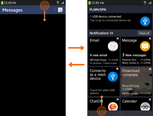
The Notification panel is a place users can check what is happening and see missed events, such as recent text messages, calls, and emails. It is a simple summary of notifications that keeps users updated.
Users can access the Notification panel from anywhere in the OS simply by pulling down on the indicator, which normally contains the on-going task display and the event notification display.

If the content to display exceeds one page, users can scroll up and down. For event notifications, users can dismiss these in the Notification panel by tapping the Clear all button.
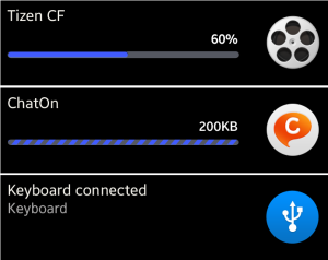
The on-going task display shows current events (esuch as the status of a file transmission) or information about connected devices (such as USB connection).

The event notification display shows information about new events that the user has not checked yet, such as the title of the event, sender, short contents, app icon, and timestamp.
If an application has more than two event notifications, you should present them in a single notification box. However, if it is important to have a path to each, exceptions can be made to display multiple notifications from a single application in the notification box.

In a single event type, set the image as a background image of the box (if it is downloaded); otherwise, you can display its information in the notification.
Ticker notifications
A ticker is a type of notification where two lines of information appear in the status area for a limited amount of time, including the following:
- Icon
- Text (main text and subtext)
- Close button
If you enable the Display contents notification option, the ticker shows detailed information of the content (or representative general text). Note that ticker notifications must not interrupt running user applications. If the user taps on the ticker, he or she will see the event's detail screen. If the user unlocks the screen before the ticker disappears, it remains in the status area of the unlocked screen.
Pop-up notifications
Use pop-up notifications to deliver information or request user confirmation.
Depending on the nature of the information, notifications fall into one of three categories:
- Basic information delivery: This pop-up notification is temporary - its purpose is to deliver information to the user before disappearing from the application screen after a certain amount of time. It can also disappear when the user taps an area outside the pop-up notification box.
- Important information delivery: This pop-up is used to deliver important information or alert users to the crucial steps of a process. It remains on the screen until the user deliberately closes it by tapping the OK or Confirm button.
- Run/delete choice: The user decision dictates the outcome of this notification. Use it to prompt users to confirm they want to run or delete something that is not recoverable.

Badge notifications
Not all events require immediate notification. In such cases, you can use a badge to convey this type of non-urgent information (e.g., the number of events). You can add a small badge on the App icon, or the user can check it when launching an application.

Use the following guidelines when creating badge notifications:
- Only display them for new and unread items.
- Display them as a number, with the figure on the badge icon indicating the number of new and unread items.
- If there is more than one new or unread item, the number that displays in the badge must decrease as the user views or reads each item. The text informing the user of the new item should also disappear.
- Place badge icons at the top right corner of each icon or control.
- Use no more than four digits in a badge icon.
