Tizen UX Conversion Tutorial: Checkout Tutorial - Part 1
PUBLISHED
Overview
This article is part one of a two part series that demostrates the Checkout UI pattern, implemented in part 1 using jQuery. Then in part 2, the UI is modified to follow the Tizen UX Guidelines.
The checkout sample application is based on jQuery multi page. The application demonstrates how the checkout page can be designed for the Tizen applications.A checkout page can have different styles (like List views), based on the requirements.
Main Screen
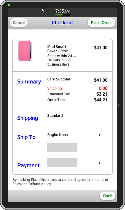
The application home page provides a list based view. The unordered list is place in content of the body. It contains information regarding the item, shipping, address and payment. The address and payment items link to different pages facilitating the option to provide information. Grid layout is used to properly align the item details.
<li data-corners="false" data-shadow="false" data-wrapperels="div"
      data-icon="false" class="ui-li ui-btn-up-c">
  <div class="ui-grid-b">
    <div class="ui-block-a">
      <img src="WebContent/images/iPad-mini-pink.jpg" class="ui-li-thumb"
	   align="left">
    </div>
    <div class="ui-block-b">
      <p class="ui-li-heading"> </br> iPad Smart </br>Cover - Pink </p>
    </div>
    <div class="ui-block-c">
      <p class="ui-li-desc" align="right"> </br> $41.00 </p>
    </div>
    <div class="ui-block-a"></div>
    <div class="ui-block-b">
      <p class="ui-li-desc"> Ships within 24 hrs </br> Delivers in 3 -5 </br>business days</p>
    </div>
    <div class="ui-block-c"></div>
  </div>
</li>
The home screen of the application also contains two buttons Help and Contact Us. On click, the help button navigates to help page and Contact Us will launch
a popup dialog.
<div class="ui-grid-a">
  <div class="ui-block-a">
    <a href="#two" data-role="button">Help</a>
  </div>
  <div class="ui-block-b">
    <a href="#popup" data-role="button" data-rel="dialog"
	data-transition="pop">Contact us</a>
  </div>
</div>
Page Navigation
Page navigation is implemented by setting the visibility state of the div containers in the body.
document.getElementById(currentPage).style.display = 'none';
document.getElementById(nextPage).style.display = 'block';
previousPage = currentPage;
currentPage = nextPage;
$(document).scrollTop(0);
Update Data Fields
The address and payment details are updated on navigating back to the home page using jQuery function.
var val;
if(id == "shipInfo")
{
  val = document.getElementById('address').value;
  $('#shipping').text(val);
}
else
{
  val = document.getElementById('cardNum').value;
  $('#payment').text(val);
}
CSS
CSS styles are applied to the buttons in header to distinguish their state.
.header-button a:link {
  font-family: "Times New Roman", Times, serif;
  color: green;
  text-decoration: none;
}
.header-button a:hover {
  font-family: "courier", Times, serif;
  COLOR: brown;
  font-weight: bold;
  text-decoration: none;
}
Color property is used to highlight the shipping, address and payment details.
.ui-block-b .ui-shipping {
  font-family: "arial", Times, serif;
  color: red;
}
.ui-grey-colored {
  background-color: lightGrey;
  background-position: 2px 2px;
  height: 30px;
  max-height: 40px;
  font-family: "Times New Roman", Times, serif;
  font-size: 1.25em;
  color: purple;
}
.ui-block-a .ui-li-desc {
  font-family: "Times New Roman", Times, serif;
  font-size: 1.25em;
  font-weight: bold;
  color: blue;
}

.ui-block-b .ui-li-heading {
  font-family: "courier", Times, serif;
  font-size: 1;
  font-weight: bold;
  color: black;
}
Snapshot:
Below is the snapshot of the checkout page from sample application.

