JQuery to Tizen UX Conversion Tutorial: Page Carousel Tutorial - Part 1
PUBLISHED
PageCarousel
Overview
This article is part one of a two part series that demostrates the Page Carousel UI pattern, implemented in part 1 using jQuery. Then in part 2, the UI is modified to follow the Tizen UX Guidelines.
It also demonstrates how to create customized Photo Album withiImage followed by subtext and changing images of a given category in content view once the user selects any item in tabbed menu.
Page Carousel HTML Page
The html page is divided into different sections like TitleBar which has icons and title, content which has images and page control and a footer which has a tabbed menu as shown in below screenshot.
TitleBar
In this application, instead of using div element with data-role="header", seperate header style has been defined and applied since default Tizen header has different look and feel.
<div class="ui-page-header ">
  <table style="width:100%">
    <tbody>
      <tr>
        <td style="width: 80%"><p id="pagetitle" class="ui-title">RECEIPES</p></td>
        <td style="width: 10%"><img class="ui-pc-search " src="./images/search.png" /></td>
        <td style="width: 10%"><img class="ui-pc-search " src="./images/previous-page.png" /></td>
     </tr>
    </tbody>
  </table>
</div>
Image Carousel
To create a Content View with three images as shown in screenshot, separate styles have been defined for all images, text and background applied to 'div' elements as shown below
<div id="carusel" class="ui-main-content">
 <div class="ui-coru-background ui-coru-item-prev">
 <img id="prev-image" class="ui-coru-image-thumb"
	src="./images/recepies/RECE-01.jpg" />
 <div class="ui-coru-sub-text1">First Text1</div>
 <div class="ui-coru-sub-text2">Sub Text</div>
 </div>
 ....
Page Control
Tizen Page control is used by specifying the data-max attribute to number the images in carousel and a default value data-value
 <div class="ui-coru-pagecontrol" id="pagecontrol1"
	data-role="pagecontrol" data-max="5" data-value="2"></div>
Tabbed Menu
A tabbed menu is created with list items by specifying styles in CSS and applied to "li" elements as shown below.
<div class="ui-page-tab-control">
<ul class="tabs group">
  <li id="list1" class="active">
   <a> <img class="ui-coru-tab-icon" src="./images/receipe.png" />
     <div class="ui-coru-font">RECEPIES</div></a></li>
  <li id="list2"><a><img class="ui-coru-tab-icon" src="./images/video.png" />
     <div class="ui-coru-font">VIDOES</div></a></li>
  <li id="list3"><a><img class="ui-coru-tab-icon" src="./images/shopping.png" />
     <div class="ui-coru-font">SHOPPING</div></a></li>
  <li id="list4"><a><img class="ui-coru-tab-icon" src="./images/more.png" />
     <div class="ui-coru-font">MORE</div></a></li>
</ul>
</div>
Page Carousel CSS File
Image Carousel Style
Styles for an image background, image, subtext and positions for all images are shown below
ui-main-content {
	position: relative;
	width: 100%;
	height: 60%;
}
.ui-coru-background {
	width: 60%;
	background: white;
	border-radius: 4%;
}
.ui-coru-item-prev {
	position: absolute;
	left: -45%;
}
.ui-coru-item-curr {
	position: absolute;
	left: 20%;
}

.ui-coru-item-next {
	position: absolute;
	left: 85%;
}
.ui-coru-item-next1 {
	position: absolute;
	left: 150%;
}
.ui-coru-item-next2 {
	position: absolute;
	left: 215%;
}
.ui-coru-image-thumb {
	width: 92%;
	height: 80%;
	margin-top: 4%;
	margin-bottom: 4%;
	margin-right: 4%;
	margin-left: 4%;
	border-top-left-radius: 4%;
	border-top-right-radius: 4%;
}
.ui-coru-sub-text1 {
	width: 90%;
	font-size: 24px;
	color: black;
	text-align: center;
	margin-left: 5%;
	margin-right: 5%;
}
.ui-coru-sub-text2 {
	width: 90%;
	font-size: 18px;
	color: grey;
	text-align: center;
	margin-left: 5%;
	margin-right: 5%;
}
Tabbed Menu
A rounded, border tabbed menu can be created inside a list view with using "float:left" CSS property to align all the list item horizontally. For more instructions see Rounded Out Border Tabbed Menu. To fit this tabbed menu in different layouts, we can define style for different content pages as shown below:
@media ( max-width : 600px) {
   .ui-page-tab-control {
	position: fixed;
	/*z-index: 1000;*/
	width: 100%;
	top: 85%;
	height: 15%;
	font-size: 35%;
	font-weight: bold;
	overflow-x: hidden;
	overflow-y: hidden;
} }
Page Carousel JavaScript File
Handling Swipe Events
On user's swipe events, images in the content area are scolled from left to right based on swipe direction. This functionality can be acheived by moving the page scroll view as shown below.
$("#content").on('swipeleft', function(e) {
	if( index < 6)
	{
		$("#carusel").animate( 	{"left": "-=65%"},"slow");
		index++ ;
		$('#pagecontrol1').pagecontrol("value", index);
	}
});
Handling Click Event on Tabbed Menu
The below sample code used for changing the tabbed Menu state to active and changing images in content area with VIDEO images.
$(function() {
	$("li").click(function(e) {
		e.preventDefault();
		$("li").removeClass("active");
		$(this).addClass("active");

		});
	});

$("#list2").bind("vclick", function() {
	$("#pagetitle").text("VIDEOS");
	var data=   ' <div  class="ui-coru-background ui-coru-item-prev">';
	data += '<img id="prev-image" class="ui-coru-image-thumb" src="./images/videos/01.jpg" />';
	data +=  '<div class="ui-coru-sub-text1">First Text1</div>';
	data  +=  '<div class="ui-coru-sub-text2">Sub Text</div>';
	data += '</div>';
	data += '<div  class="ui-coru-background ui-coru-item-curr">';
	data += '	<img id="curr-image" class="ui-coru-image-thumb" src="./images/videos/02.jpg" />';
	data += '	<div class="ui-coru-sub-text1">First Text2</div>';
	data += '	<div class="ui-coru-sub-text2">Sub Text</div>';
	data +=  '</div>';
	data += '<div  class="ui-coru-background ui-coru-item-next">';
	data +='	<img id="next-image" class="ui-coru-image-thumb" src="./images/videos/03.jpg" />';
	data += '	<div class="ui-coru-sub-text1">First Text3</div>';
	data +='	<div class="ui-coru-sub-text2">Sub Text</div>';
	data+=  '</div>';
        $("#carusel").empty().append(data);
});
Screenshots
Below is the screenshot of the Page Carousel View
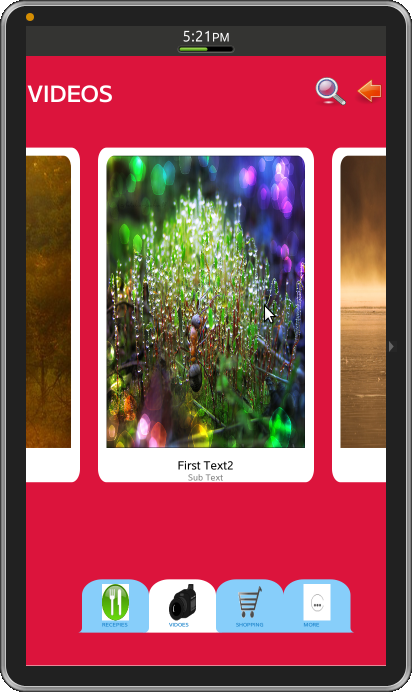 Figure-1: Page Carousel View