Tizen UX Conversion Tutorial: Springboard-Based Navigation - Part 1
PUBLISHED
Springboard Menu
Overview
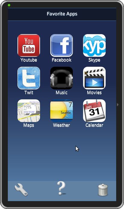
This Springboard sample application is based of jQuery multi page. The application demonstrates how the Springboard navigation menu can be designed for the Tizen applications. Let’s understand the implementation details for the application.
Note: Refer to Tizen-ux-conversion tutorial for coverting this jQuery design application to be in align with the Tizen UX guidelines.
Springboard Navigation Menu
The application home page layout consists of custom icons positioned using jQuery Mobile's layout grids. A div with a class of “ui-grid-b “(a/b/c/d) creates a layout grid based on three columns. Each column is designated by a child div with a class of ui-block-a(/b/c/d/e), ordered alphabetically from left to right, up to the number of columns dictated by the parent ui-grid configuration. Similarly, the grid wraps around to a new row by repeating the sequence of columns.
<div id="top" class="ui-grid-b springboard">
  <!-- row 1, column 1 -->
  <div id="Youtube" class="ui-block-a">
    <a href="#two" data-transition="flip">
      <img src="WebContent/Youtube.png" class="springboard-portrait-img"></img>
    </a>
    <p>Youtube</p>
  </div>

  <!-- row 1, column 2/3 -->
  <!-- row 2, column 1/2/3 -->
  <!-- row 3, column 1 -->
  <!--  Code here  -->
  <!-- row 3, column 2 -->

  <div id="Weather" class="ui-block-b">
    <a href="#two" data-transition="flip">
      <img src="WebContent/weather.png" class="springboard-portrait-img"></img>
    </a>
    <p>Weather</p>
  </div>

  <!-- row 3, column 3 -->
  <div id="Calendar" class="ui-block-c">
    <a href="#two" data-transition="flip">
      <img src="WebContent/calendar.png" class="springboard-portrait-img"></img>
    </a>
    <p>Calendar</p>
  </div>
</div>
Customizing Header/Footer
Using jQuery Mobile you can incorporate the default or custom icon into a button, this sample uses a custom image itself as the button in the footer.
To achieve this customized header styling for all the secondary page headers or footers, wrap all links in the header inside a div, as to prevent the jQuery Mobile framework from automatically transforming the links into toolbar buttons.
- Custom Header
The header has a CSS class "custom-header" defined for the required look and feel, over-riding the default theme.
<div data-role="header" data-theme="b" class="custom-header">
  <h1 class="springboard-header"> Favorite Apps </h1>
</div><!-- /header -->
- Custom Footer
The custom images for help/delete/settings are added in the footer as below.
<!-- footer -->
<div data-role="footer" data-position="fixed" data-theme="b" class="custom-footor">
  <div class="springboard-settingicon">
    <a href="#settings">
      <img src="./css/images/settings.png"></img>
    </a>
  </div>
  <div class="springboard-deleteicon">
    <a href="#delete">
      <img src="./css/images/delete.png"></img>
    </a>
  </div>
  <div class="springboard-helpicon">
    <a href="#help">
      <img src="./css/images/help.png"></img>
    </a>
  </div>
  <h4 class="springboard-footer"></h4>
</div><!-- /footer -->- Buttons
The button widget is coded with standard HTML anchors and input elements and then enhanced by jQueryMobile to make it more attractive or inline with the toolbars theme in which the widgets are positioned. The back navigation behavior for this custom toolbar button is achieved by setting the data-rel="back" attribute on the anchor.
<a href="#one" data-role="button" data-inline="true" data-mini="true" data-icon="back"
   class="ui-btn-right custom-footor back-button">Back</a>
CSS Gradients for Background
The sample uses the CSS3 gradient feature for the background to look absolutely rich and beautiful.
/* Second page gradient background */
#secondpagebg {
	background: -webkit-gradient(linear, left top, left bottom, color-stop(24%,#1e2a4f),
                     color-stop(100%,#7db9e8)); /* Chrome,Safari4+ */
	background: -webkit-linear-gradient(top, #1e2a4f 24%,#7db9e8 100%); /*
                     Chrome10+,Safari5.1+ */
 	width: 100%;
	height: 1280px;
}- CSS Classes
CSS classes have been used for defining the styles for text/font.
Below is how the text have been positioned to display the credits information using the CSS class.
/* Style for Credits */
.springboard-credits {
    position: absolute;
    bottom: 200px;
    width: 100%;
    margin-left: -15px;
    margin-right: -15px;
    text-align: center;
    font-size: 15px;
    color: white;
}
The help image in the applications home page footer (custom footer) has been positioned with the below class properties.
/* custom image-based help icon for jQM footer */
.springboard-helpicon {
	margin-left: auto;
	margin-right: auto;
	width: 15%;
	height: 15px;
}
Deleting applications from Springboard (Using JavaScript)
You can delete the application from the Springboard when not needed.
The below code snippet from the sample application demonstrates the deletion of the applications using the JavaScript.
// Function to remove the application from the springboard
function removeApp(pDiv){
   var appname = document.getElementById('AppNameText').value;
   if (document.getElementById(appname)) {
         var child = document.getElementById(appname);
         var parent = document.getElementById(pDiv);
         parent.removeChild(child);
         alert("Application Deleted");
    }
    else {
         alert("Application removed or does not exist.");
         return false;
    }
}
Snapshot:
License:
The icons used in the applications are licensed under Creative Commons License Attribution-ShareAlike 2.0.
Development Environment:
Tizen SDK
Version : 2.0.0
Build id : 20130214-1647
Note:
The sample application is available for reference (See under File Attachment section).