New in Tizen 2.3
PUBLISHED
Tizen 2.3 is optimized for small screen UX. Especially it is fit for WVGA resolutions, so some changes have been made related to viewing content in a small screen device.
Screen Structure
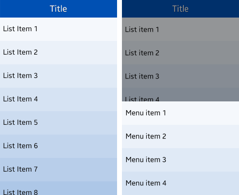
The layout structure primarily consists of the header and content areas. In a small screen, most application functions should be placed in the More menu. For more details, see UI Overview.
Figure: Application screen structure and the More menu

Notifications
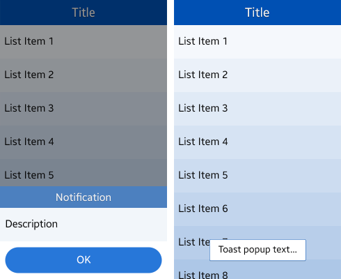
When showing a pop-up, the width of the popup fits the width of the screen in portrait mode. For seamless usage, the pop-up appears from the bottom center of the screen. In addition, toast pop-ups can be used to inform the user of simple notifications or changes in the current state. For more information, see Notifications.
Figure: Notification and toast pop-up

In addition to the major changes, there are the following changes in Tizen 2.3:
- Header layout: The header string is center-aligned. If a button is needed, place it as an icon or text. For more information, see Header.
- Controls: New control elements suitable for the Tizen 2.3 light theme have been added. For more information, see Asset Library.
