Languages

Menu
Sites
Language
The text is hidden behind the visible area of Entry

Tizen.Wearable.CircularUI = 1.4.0
Xamarin.Form = 4.3.0.908675

How to make the cursor not go beyond the visible area? I wrote numbers from 1 to 8, but 7 and 8 are not displayed (the field is in focus and should be visible).
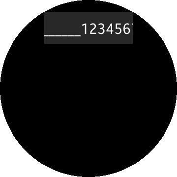
MainPage = new ContentPage
            {
                Content = new CircleStackLayout
                {
                    VerticalOptions = LayoutOptions.FillAndExpand,
                    HorizontalOptions = LayoutOptions.FillAndExpand,
                    Children = {
                        new Entry
                        {
                            HorizontalOptions = LayoutOptions.FillAndExpand,
                            HorizontalTextAlignment = TextAlignment.Center,
                            Placeholder = "Test Placeholder",
                        },
                    }
                }
            };

The same behavior is obtained when using Margin in Entry in StackLayout (numbers from 1-9):
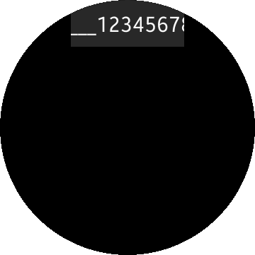
 

 MainPage = new ContentPage
            {
                Content = new StackLayout
                {
                    VerticalOptions = LayoutOptions.FillAndExpand,
                    HorizontalOptions = LayoutOptions.FillAndExpand,
                    Children = {
                        new Entry
                        {
                            Margin = new Thickness(100, 0),
                            HorizontalOptions = LayoutOptions.FillAndExpand,
                            HorizontalTextAlignment = TextAlignment.Center,
                            Placeholder = "Test Placeholder",
                        },
                    }
                }
            };


Edited by: Ivan Kudryavsky on 30 Apr, 2020

Responses

2 Replies
Alvarez

It is very difficult to manage text viewability in PopupEntry while entering text.

See this bug filed about PopupEntry in the github repository.

https://github.com/Samsung/Tizen.CircularUI/issues/277

It report similar problem, adding that HorizontalTextAlignment does not work as expected.

Ultimatly developers decided it is not a problem, adding that user can swipe text to see hidden part, but i think they made a very poor decision, please voice your concern about it.


Tizen .NET

Hello Ivan Kudryavsky,

There seems to be a size related issue on CircleStatckLayout like Alvarez mentioned with an issue link.

Workaround is to use StackLayout. I just changed the vertical option to center so the Entry is fully shown in circle shape. 

My testing environment is

  • Xamarin.Forms : 4.3.0.908675
  • Tizen.CircularUI: 1.4.0
  • Tizen Wearable 5.5 Emulator
MainPage = new ContentPage
{
    Content = new StackLayout
    {
        HorizontalOptions = LayoutOptions.FillAndExpand,
        VerticalOptions = LayoutOptions.CenterAndExpand,
        Children =
        {
            new Entry
            {
                HorizontalOptions = LayoutOptions.FillAndExpand,
                HorizontalTextAlignment = TextAlignment.Center,
                Placeholder = "Test Placeholder"
            }
        }
    }
};

Two images you attached seems all using CircleStackLayout. How about re-trying using StackLayout? 

If the problem still occurs, please let us know which version of emulator you used.